
Step-by-Step Guide: How to Use Chakra UI to Create Accessible Forms on Your Website


Introduction
When creating forms on websites, it is crucial to incorporate accessible forms when building any project. Accessible forms are important as they ensure that everyone who accesses a website can interact with the website without difficulties.
Accessible websites are designed to ensure inclusivity for people, who are using keyboard navigation, screen readers and other assistive technologies. This includes those with eye impairment, motor impairments as well as cognitive limitations
The Web Accessibility Initiative highlights areas in which accessibility should be incorporated in forms for a more inclusive website. They include labeling controls, grouping controls, form instructions, validation input, and user notification.
So, in this tutorial, you will learn how to use Chakra UI to build more accessible forms for prospective users of your website.
What is Chakra UI?
Chakra UI is a flexible UI library for React. The library consists of several pre-built components that allow developers to create stunning user experience, and with fewer lines of code. Some instances of its component span across buttons, form elements, typography, layout specifications and so much more.
What makes Chakra UI powerful is that most of its components incorporate the core elements of Web accessibility. So, they make it much easier to build more accessible websites in your react project.
Prerequisites
Node or yarn installed
Basic understanding of React
Setting Up the Project files
Create React App provides a way to create projects using templates, which specify the files and dependencies included in the project. So, you can use the code below to create a new react project with ChakraUIinstalled automatically.
For NPM
npx create-react-app my-app --template @chakra-ui
For Yarn
yarn create react-app my-app --template @chakra-ui
When it is installed, run this command:
cd my-app
Then run this command as well to start the development server:
npm start
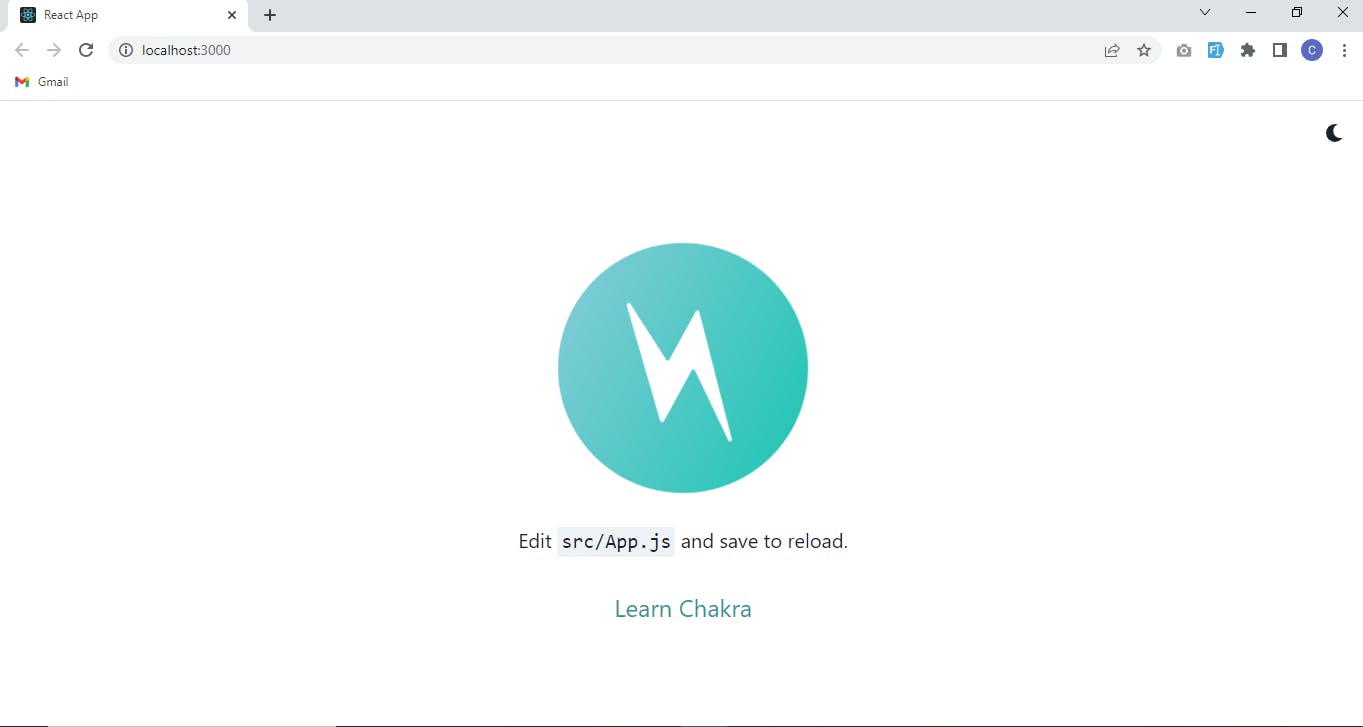
Your app should start on localhost:3000 after some minutes.
Here is the image of what your file should look like -
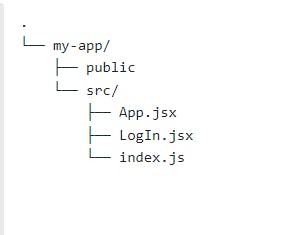
Folder structure
The only files needed for this specific project are the App.js and a LoginPage.jsx
So, your project folder tree should look like this-
ChakraUI setup for existing projects
The official templates come with Chakra UI dependencies already installed and include Chakra-specific features.
However, if you have an existing project, you can add Chakra UI by running either of the following commands:
NPM
"npm i @chakra-ui/react @emotion/react @emotion/styled framer-motion".
YARN
yarn add @chakra-ui/react @emotion/react @emotion/styled framer-motion
This will install Chakra UI to your existing project.
Also, run the following commands
npm install @chakra-ui/icons
This will install @chakra-ui/icons to have access to icons.
Creating the App.js file
Then, proceed to the index.js file in your root folder and wrap the App component like this:
import React from 'react';

Import “./App”
Import {ChakraProvider} from “@chakra-ui/react”
Function App( ) {

return (
    <ChakraProvider>
        <App />
    </ChakraProvider>
    )
}

export default App;
Your ChakraProvider component has to be set up at the root of the application. The goal here is to wrap the App components with ChakraProvider so that the App component can access the properties from Chakra UI library.
Creating the form
What each react component does
The code below is a React component that renders a login form. Let's go through each line to understand what it does
Color Mode Functionality
import { useState } from 'react';
import {Flex, Text, Heading, Input, Button, InputGroup, Stack, InputLeftElement, Box, Avatar,  FormControl, FormHelperText, InputRightElement,  IconButton,  useColorMode,  Link} from '@chakra-ui/react';
import { MoonIcon, SunIcon } from '@chakra-ui/icons';
import { FaUserAlt, FaLock } from 'react-icons/fa';
const CFaUserAlt = chakra(FaUserAlt);
const CFaLock = chakra(FaLock);
const SignInPage = () => {
  const { colorMode, toggleColorMode } = useColorMode();
      return (
           <>
              <IconButton mr="10" w={6} h={6} p={5} onClick=                    {toggleColorMode} aria-label='Toggle screen theme'>
{colorMode === 'light' ? <MoonIcon /> : <SunIcon />}
             </IconButton>
            </>
    );
};

export default SignInPage;
Code explanation
To explain the above code. The useColorMode hook is from @chakra-ui/react and that is used to handle color changes in the app. The hook provides two values - the colorMode and toggleColorMode. The colorMode value returns either a dark or a light mode depending on the user.
Also, toggleColorMode function allows the switch between a light or a dark theme.
The IconButton component (which is also imported from @chakra-ui/react uses the onClick event to trigger the toggleColorMode whenever the button is clicked.
The IconButton component takes in conditional children components. This is determined based on either value of the colorMode. So, if the colorMode equals to dark, the component will render the SunIcon component from chakra-ui icons, and renders the MoonIcon component if the colorMode equals to light
The IconButton component also has props such as mr (margin-right), w (width), h (height), and p (padding), which sets the margin-right, width, height, and padding respectively.
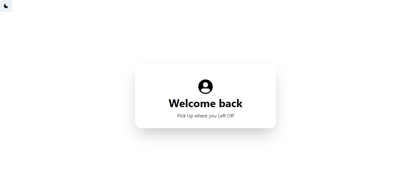
This is how this should look like:


How the ColorMode aids accessibility
The aria-label enhances accessibility and helps users who rely on screen readers to understand the purpose of the icon.
The icon itself provides a toggleColorMode which allows users to access the website at night without the brightness of a white screen
Form Heading Card
After the IconButton component, add these lines of code:
<Flex
    flexDirection="column"
    width="100wh"
    height="100vh"
    justifyContent="center"
    alignItems="center"
    role="main">
        <Stack
            flexDir="column"
             mb="2"
             justifyContent="center"
             alignItems="center"
             width={{ base: '90vw', md: '468px' }}
             padding="50px 10px 30px 10px"
             boxShadow={colorMode === 'light' ? '2xl' : 'dark-lg'}
             borderRadius="20px"
             tabIndex="0">

          <Avatar
             bg={colorMode === 'light' ? 'black' : 'gray.900'} alt="User avatar"/>
         <Heading color={colorMode === 'light' ? 'black' : 'gray.100'}
               aria-labelledby="welcome-back">Welcome back</Heading>
         <Text label="Pick up where you left off">Pick Up where you Left Off</Text>
    </Stack>
</Flex>
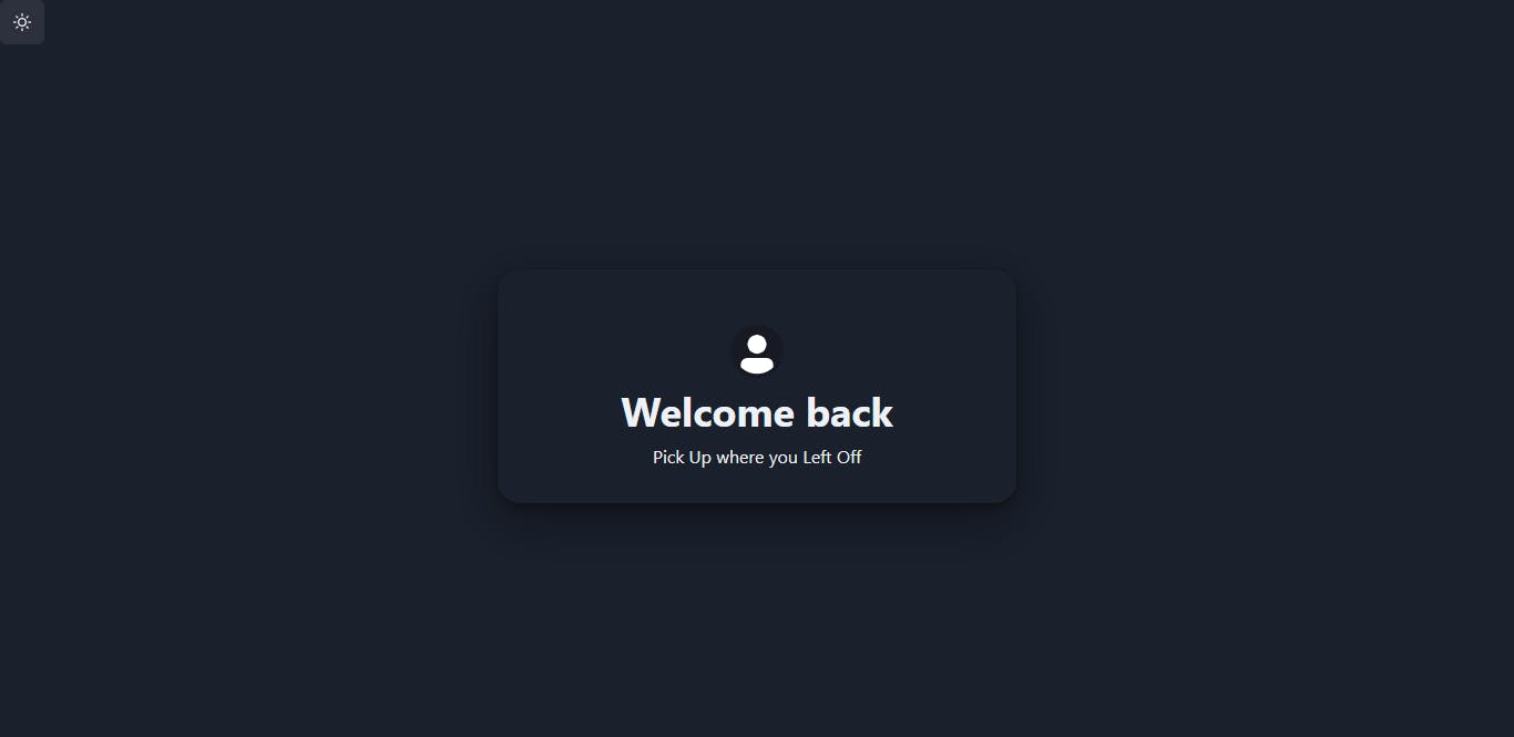
Form Heading Code explanation
The Flex component is rendered just below the IconButton and its direction is set to column since the form needs to be stacked horizontally. The Flex component has an aria role set to main. This is to indicate the main content of the document for those who are using screen readers.
The next component to be rendered in the Flex Component is the Stack component, which is used to align and stack multiple items vertically. Its direction is set to column and the content is aligned to the center both horizontally and vertically.
The box shadow of the Stack Component is rendered dynamically. If the colorMode. If the color mode is "light", the box shadow will be "2xl", otherwise it will be "dark-lg". The border radius of the Stack component is set to 20px, giving it a rounded border.
How Form Heading improves accessibility
The tabIndex is added as a property in the
StackComponent astabIndex="0"- This sets the tab index of the Stack component to 0, making it focusable and tabbable for keyboard users.<Avatar bg={colorMode === 'light' ? 'black' : 'gray.900'} alt="User avatar" />- This line creates an Avatar component with the background color set based on the color mode. If the color mode is "light", the background color will be "black", otherwise it will be "gray.900". The alt attribute is added with the value "User avatar" to provide a text description of the image for screen readers.<Heading color={colorMode === 'light' ? 'black' : 'gray.100'} aria-labelledby="welcome-back">- This line creates a Heading component with the text "Welcome back" and the color set based on the colorMode currently in use.
Form fields code
<Box minW={{ base: '100%', md: '468px' }}>
    <Stack spacing={5} p="1rem" boxShadow="md">
        <FormControl>
            <InputGroup>
                <InputLeftElement pointerEvents="none" children={<CFaUserAlt color="gray.300" />}/>
                    <Input type="email" placeholder="email address" />
             </InputGroup>
        </FormControl>

        <FormControl>
            <InputGroup>
                <InputLeftElement pointerEvents="none" color="gray.300" children={<CFaLock color="gray.300" />} />
                <Input type={showPassword ? 'text' : 'password'} placeholder="Password" name="signupPassword" />
                <InputRightElement width="4.5rem">
                    <Button h="1.75rem" size="sm" onClick={handleShowClick}> {showPassword ? 'Hide' : 'Show'} </Button>
                </InputRightElement>
            </InputGroup>
            <FormHelperText textAlign="right">
                <Link>forgot password?</Link>
            </FormHelperText>
        </FormControl>
        <Button borderRadius="50px" type="submit" variant="solid" colorScheme="blue" width="full" > Log in </Button>
        <Text textAlign="center " textDecoration="underline" cursor="pointer" > Continue with Google Here </Text>
    </Stack>
</Box>
<Box> New to us? <Link>Sign Up here</Link> </Box>
Form Fields Code explanation
<Box minW={{ base: '100%', md: '468px' }}>:The box component has a minimum width of 100% on base screens and 468px on medium screens. This sets the minimum size of the container, making it responsive to different screen sizes.<Stack spacing={5} p="1rem" boxShadow="md">: The Stack component acts as a container for the form controls and provides a visual separation between the form and the background.<FormControl>:This wraps each form input field and its associated label and error message.<InputGroup>:The InputGroup component that groups the input and its associated icon or button.<InputLeftElement pointerEvents="none" children={<CFaUserAlt color="gray.300" />} />:The InputLeftElement component displays a user icon on the left side of the email address input field. The pointerEvents property is set to "none" to prevent accidental clicking on the icon.<Input type="email" placeholder="email address" />:This component displays an email address input field. The type property is set to "email" to indicate the input type and the placeholder property sets the prompt text inside the input field.<InputLeftElement pointerEvents="none" color="gray.300" children={<CFaLock color="gray.300"> :The InputLeftElement component that displays a lock icon on the left side of the password input field. The pointerEvents property is set to "none" to prevent accidental clicking on the icon.<Input type={showPassword ? 'text' : 'password'} placeholder="Password" name="signupPassword" />:A Chakra UI Input component that displays a password input field. The type property is either "text" or "password" based on the value of the showPassword state (already imported in the initial boilerplate). The placeholder property sets the prompt text inside the input field and the name property sets a unique name for the input field for accessibility purposes.<InputRightElement width="4.5rem">: The InputRightElement component that displays a button on the right side of the password input field. The width property sets the width of the element to 4.5rem. This helps to toggle between hiding and showing the password, which helps users who may have difficulty remembering passwords.<Button h="1.75rem" size="sm" onClick={handleShowClick}>:A Chakra UI Button component that toggles between "Show" and "Hide" when clicked. The h property sets the height of the button to `1.75rem.<InputRightElement width="4.5rem">: This component is used to position elements to the right side of the input element.<Button h="1.75rem" size="sm" onClick={handleShowClick}>:The button has a height of 1.75 rem and a small size. It also has an onClick event that triggers thehandleShowClickfunction. The text inside the button changes based on the value ofshowPassword; if it's true, the text is "Hide", otherwise, it's "Show"<FormHelperText textAlign="right">:This component is used to provide additional information or help text for the form. The text is aligned to the right side. The form has a "FormHelperText" that includes a link to "forgot password?" which is helpful for users who have forgotten their password and need to reset it.<Link>forgot password?</Link>: This is a link that, when clicked, takes the user to a page or section where they can reset their password.<Button>:This is the submit button for the login form. It has a rounded border radius of 50px, a type of "submit", a solid variant, a gray color scheme, and a full width. The "Log in" button uses a "borderRadius" of 50px, which makes the button easier to click or touch for users with fine motor skill difficulties.<Text >: This text component has its text aligned to the center, has an underline text decoration, and a pointer cursor. The text invites the user to continue the login process using their Google account.<Box>: This is a simple container component with a text message "New to us?" and a link.
Conclusion
In conclusion, including accessibility forms is crucial for ensuring inclusivity and accessibility for all website users. Chakra UI is a powerful UI library for React that makes it easy to build more accessible websites. Its pre-built components incorporate the core elements of web accessibility, making it an ideal choice for a developer who wants to create a stunning user experience with fewer lines of code. Furthermore, the use of the colorMode functionality in Chakra UI allows users to switch between light and dark themes, making it easier for users with visual impairment to navigate and use the website. Using Chakra UI to build accessible forms is an essential step toward creating a more inclusive website for all users.